Tuesday, August 30, 2011

COMPLETED Arts & Crafts Inspired Living Room!

OK, so remember that movie with all of the single 20 and 30 year olds...yeah I know, that's like half of the movies out in the last 5 years, right?  I believe it's called He's Just Not That Into You.  I never saw it, but I did see the trailers, and I remember Drew Barrymore stating something about how she and her boyfriend were trying to connect to break up, and she tried texting, email, Facebook, phone, twitter, etc. and after trying "7 different portals of communication", she still didn't succeed!  Or something like that...Short story long -- that's how I feel sometimes when I want to share some of my design work.  Hmmm, should I write a blog, and then through Networked Blogs it will go to FB personal and FB business and Twitter, but I don't have the time to write and put it together how I want, but I want to share, so maybe I should just post pics quickly to FB business and 'share' with FB personal and LinkIn, but some people aren't on FB, and just signed up via email to My Blog, people who I know really would want to see the new pics, but...and...but...and...  SO if you've seen these new pictures already on Facebook, well, you'll just have to enjoy them again!  And please...do enjoy!!

Bench seat we installed in an unused nook near the fireplace.  Fabricut bench seat fabric.  Lee Industries fabric for back.  Custom front rosette pillow.  Green ombre' pillows from Pier 1.  Grey pillow came with the sofa.

One of my favorite pieces in this ensemble is the modern wing chair with a linen slipcover by Lee and it swivels!  Custom designed cocktail table with antique Turkish copper plate, leather/faux mohair studded sofa.

My client found the wonderful charcoal grey/green vines fabric and made two pillows for the living room sofa.  Aren't they perfect?!  And the print is slightly raised, which gives an additional sensory element.  A Lee linen blend swivel chair, this time with a more decorative pattern.

Another view...

Seating vignette with Lee chair, client's Stickley side table.  She had two that I thought would be fabulous in the room and help to tie the room into the Arts & Crafts architecture.  Iron "bust" floor lamp.

Another view... antique Chinese grain scoop from Zachary Ltd.


Behind the sofa...antique storytelling bench from Zachary Ltd., client's antique Schells wood box, Surya bamboo throw from Jon Hampton.

3-D gold iron stars from Zachary.  Grey washed candle lanterns from Jon Hampton...I was so excited when I found these.  We placed two above the TV cabinet, and one by the fireplace.  The washed color goes with the grey faux mohair on the couch perfectly in addition to the inspiration tiles on the fireplace.  Plus I didn't want something solid because I wanted the light to make its way into the room.

Custom dogwood/moss arrangement in black metal container.  I put this arrangement together for my client on her large kitchen island, which was a perfect work spot; however, you would not have believed the mess in her kitchen from the dried goods...unless you've done that type of stuff before, then yes, you would!  But it turned out to be just what we wanted...and messes are cleanable...


Another view...coming in from the front door.  Client's own Stickley cabinet which again we wanted to have in the space.  Accent lamp with stone shade--gorgeous when lit!

Well, what do you think?  I think the environment is very serene and inviting, but lively with the punch of bright green!

*** Susan ***

Sunday, August 21, 2011

Mendota Hgts Project Progress

All right--progress is being made!  At least, visual progress!  So I can now show you some change from the "before" pics I showed you previously here for my Kitchen/Family/Living/Dining/Laundry Room(s) project.  As you remember from an earlier post here introducing this project, I am working with builder Scott Santanni of Santanni Custom Homes.  The place is now gutted and ready for install prep, the "popcorn" ceilings have been removed and replaced with "orange peel" ceilings.  The fun stuff has taken place too--selecting the finishes and 'the look' for this main floor living area!  It is going to be splendid -- and I am super excited to share it with you, so read on and look ahead!

Foyer looking into Living Room

 
 Living Room

 Dining Room

 Laundry/Mud Room -- as I write this, the new tile has already been installed -- a wonderful slate look porcelain 12x24 size, laid in a brick pattern.  Keep reading to view a picture of the tile.

 The Kitchen

 The Kitchen

 The Family Room

 Milo, one of the wonderful homeowners, who has to go to Doggie Day Care when loud tools are being used otherwise attack mode sets in, and the poor defenseless power tools are his victims.  Poor Milo -- he's being such a good sport!

 Cryptic builder notes written on the subfloor so we can remember "Yes, we did talk about that and we did all agree!"

Our fabulous selections:  Granite for the island, peninsula, and perimeter countertops.  The granite is super cool!  Keep reading for better granite pics.  The backsplash is made up of shiny glass, matte glass, and stone.  It will be installed horizontally.  The maple door is for the cabinetry except for the island which is a painted/glazed finish shown below.  It is all laying on the bamboo flooring.

This is the paint color for the island, Sherwin-Williams 7604; however, it is even more gorgeous with a light charcoal glaze over it!  I've seen the sample (sorry forgot to get a pic), and it is stunning, a truly stunning combo!

 Here is a much better pic of the granite called Black Storm.  Black Storm comes in a wide range of patterns ranging from very subtle to super busy.  This piece we are using on the island and peninsula.  The subtle golden tones tie in nicely with the maple and bamboo.

This piece is more subtle but still has the coloring of Black Storm.  We will use the white stripes part for the fireplace hearth, and the more subtle plain black for the perimeter of the kitchen counters.  This way it all relates through the same colorway without taking emphasis off the island and peninsula focal points.  It also doesn't become overwhelming with pattern.


Here, to the left, is the slate look porcelain for the back laundry/mud/powder rooms.  Next to it is the linear stripe tile, a large rectangular.  The tile and stripes will be placed vertically going up the fireplace, so tilt your head a bit...  It is all laid up on the beautiful bamboo flooring.

Well, what do you think?  Looking pretty awesome, huh?  I'm very excited about the outcome, and know it is going to look stupendous!

~~~ Susan ~~~
MyFreeCopyright.com Registered & Protected

Wednesday, August 17, 2011

My Design Office featured on Houzz.com!

Thank you Vanessa Brunner of  Houzz.com for featuring my design office as an inspiring place to work!  Click here to see it and read about it!!!

On another note, today I am totally in love with this picture!  Why not stay on the same side??  Say what you ask?  Same side of the color wheel folks!!  I love all the greens in this photo and the way they complement as well as create dissonance or interruption amongst each other.  You could do this with any hue on the color wheel.  So, take that favorite color of yours and go wild!!


Have a very colorful day!!!  Susan


MyFreeCopyright.com Registered & Protected

Wednesday, August 10, 2011

Splash of Orange

Hi!  Recently saw this pic of a bathroom designed by Tobi Fairley and wanted to share.  Without the bold orange stripes, it would still be a wonderfully designed bathroom, but the orange stripes (so simple to do, you can see a small corner of a lower stripe below, but you could get by with even one stripe) really unites all of the elements in the bathroom making the whole design more unified, more interesting and fun.  Enjoy!


*** Susan ***
MyFreeCopyright.com Registered & Protected

Saturday, August 6, 2011

The Sticky Subject of Details

Hola!  Just picked my daughter up from Spanish camp, so I am feeling the whole Espanol vibe!  I am sharing with you a "before and after" project I did in 2004.  I think it is such an incredible example of why "the finishing details" in a room are so important.  We added mainly wall treatments and a few accessories in this project (a couple rooms went beyond that).  The results are amazing!  This home was an absolute stunner even before my changes!  It was a newer home truly built to look like an older home (most of you designers probably know why that is italicized :).  The homeowner had exceptional taste and had selected beautifully upholstered as well as gorgeous casegood pieces.  My initial reaction was "You need me how?".  But once I started looking beyond the beautiful architecture, gorgeous furniture and artwork, I realized the problem that had been bothering her for some time.  She needed the space to feel finished.  Here I come to the rescue!  Below are some of the before photos:

Before

 Sitting Area off Kitchen

Dining Room

 Living Room

Living Room

Living Room sofa

 Powder Room

Powder Room

Master Bedroom sitting area

 Master Bedroom sitting area sofa


After

Sitting Area off Kitchen -- we painted the walls yellow and added a red/gold valance

Dining Room--we painted this nook red and added corner curtains.  The majority of the drape is gold with a top red border, opposite proportions of the valance in the Kitchen.  Typically, I am not a fan of stationary drapes where the rod does not continue the length of the window.  However, in this application, a full rod above all three window walls would have created a very busy feeling particularly with the iron on the chandelier and the size of the space.  We needed something to soften the large expanse of windows which looks out onto wetlands and a pond.  No privacy was needed.

Dining Room going into Living Room--starting with the yellow paint color for the Living Room.  The gorgeous blue draperies were existing.

 Living Room -- in this room we continued the yellow paint around the room and added a Phillip Jeffries blue silk wallpaper on the ceiling in between the moulding.  I also added the blue silk wallpaper in the window seat areas.  At this picture taking time, we still needed to change out the two silver framed art prints on the right to something much more dramatic.

 Living Room window seat nook

 Close up of blue silk wallpaper on ceiling -- What a doozy that was for my installer!

 
Living Room -- on the sofa, I had 3 rectangular pillows made out of a fabulous Pollack Florabundance velvet embroidered and appliqued fabric.  The three identical pillows helps to ground the sofa space.  Our array of unique pillows was kept to the window seat area.

Close up of the sofa accent pillow

 Powder Room -- in the powder room, we wallpapered the walls with a Schumacher dusty rose/taupe, small leopard print which unfortunately is impossible to detect in this pic.

Powder Room -- my client changed out the wall shelf to a small wood/rattan chest.  Excellent choice I must say!

 
 Powder Room

 Master Bedroom sitting area -- we changed the built in bookcases from across to beside the chairs.  Added more Phillip Jeffries wallcovering, but in a rice paper texture/light carmel hue.  I also added Pollack fabric accent pillows to the chairs.

Seriously, Pollack and Phillip Jeffries are two of my favorite manufacturers to use!  Love their stuff!

Close up of Master Bedroom sitting area

 
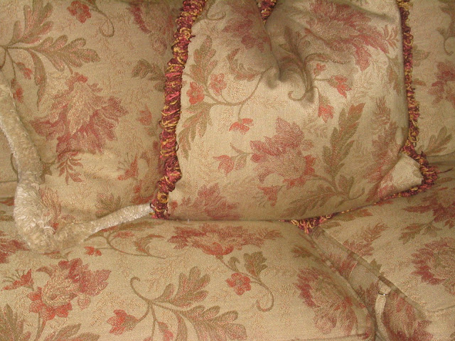
Master Bedroom sitting area sofa -- we reupholstered the very floral sofa with a, yes you guessed it!, Pollack Body Wave fabric, brush trimmed the large pillows, and added a Pollack fabric accent pillow.

 Closeup of Master Bedroom sitting area chair pillow


 The majority of changes in this home had to do with the walls and a few accent pillows.  Yes, we did add some drapery, and reupholstered a sofa, etc.  But if just the walls and pillows were added, the changes would still have been enormous!  Hope this gives you inspiration for embracing the changes you want to make in your home!  Details are crucial, and the glue that holds it, and brings it all together!

I love to hear from you! ~~ Susan

MyFreeCopyright.com Registered & Protected