Showing posts with label silk. Show all posts

Friday, December 27, 2013

Eclectic Vintage Color, Part 2 -- the Dining Room

Hi, and happy holidays to all!!

Welcome to Part 2 of my "Eclectic Vintage Color" home showcasing the Dining Room. I discussed the KITCHEN as well as project goals in Part 1 here, so check that out if you want a refresher.

For the BEFORE PICS:


And the AFTER PICS:
We started with an existing blue/gray handmade paper wallcovering we chose to keep. As in the kitchen, we continued the bamboo floors and painted the trim white. My client had inherited a beautiful vintage Henredon dining set I thought would be lovely and fulfill her vintage-love, so we reupholstered the chairs with a modern yet vintage inspired F. Schumacher fabric. We selected orange to bring in warmth, contrast with the blue walls, and give the room energy. We kept the existing and truly amazing chandelier. I believe it is a vintage Venini! Definitely a keeper! 

Bringing in more light and dark orange to coordinate with the chair upholstery, custom silk draperies with a darker accent trim were incorporated. For the wall, my client fell in love with a textile art piece found on Etsy, utilizing hand dyed fabric strips, and strengthening our blue/orange concept.

My client had purchased the artist made metal mirrors quite a few years earlier while traveling. At that time, we put them in the dining room, knowing someday when we revamped the dining room, they would be incorporated, and they worked out splendidly!

The small pillows made for the two extra arm chairs incorporate all of our colors...light and dark blue, light and dark orange, and tan hues from the floor.

For the floor, the perfect wool rug...again incorporating all of our colors. The beautiful artisan vase my client loves, now blends in with the new color scheme back at front and center in the middle of the table.

I hope your holidays have been pleasant and your New Years is fabulous!! XXOO Susan

MyFreeCopyright.com Registered & Protected

Saturday, October 26, 2013

Quick Powder Room Update!

I haven't written a blog post for almost two months, wow... So let's not dilly dally! In a large project of mine, there are a couple of powder rooms where we want updates without the expense, as we are putting quite a bit of expense into the main living areas. I'm thrilled the way they both are coming together. One is completely done, and the other is just awaiting artwork. I'll do the one that is awaiting artwork in a future post. Really! I promise! Yes, for sure!

BEFORE
What we called, the "Black" bathroom. Kind of a perfect before and after since it's near Halloween, huh?
Black, white, gold faux painted walls, sconces and shades, mirror, and pleated shade on the window. EVERYTHING, everything (ok almost) had this texture applied to it.


Here is a closeup of the treatment. Not only was it dark, and overdone, but a glossy finish had been applied to the top. Eeeek!

There was barely any light in the room because the metal sconce shades, which don't transmit much light anyway, had been painted black. Since the bathroom faces the front door entry, you couldn't really keep the shade up. The off white floor and white ceiling/trim only made the situation worse.


Lovely little cabinet that I removed and did not replace. Not particularly attractive either.

AFTER!!
Now called the "Lotus" bathroom. I kept the flooring, white pedestal sink and white toilet. I also kept the gold and black faucet, a truly wonderful design. I also kept the gold towel bar and ring. Ta-daa!
It's now a little jewel box! I installed a new mirror and new Jonathan Adler bamboo inspired sconces. 

I had the ceiling "de-popcorned" and painted a metallic gold. I also installed much larger artwork tying in the black. Incidentally, the wallpaper is called Lotus, and as I was about to have the artwork installed, I noticed on the back it was called Lotus too! How serendipitous!

The rug is a wool/silk blend that is a strike off or sample for a much larger rug. I love using these for bathrooms, powder rooms, etc. I have them all over my house. The quality and richness is amazing and truly elevates the status of a bathroom. Often, higher quality rug places will have these for sale for almost nothing! The shade is a simple gold colored pleated shade in the top down/bottom up style since this bathroom faces the front of the house. It still lets in plenty of light, which is probably why it's hard to even notice in the down position here.

Since there's no storage with a pedestal sink, and this bathroom is larger than your typical powder room, I got this cute little cabinet for TP and extra towel storage (contemplating switching out the towels to a darker color...hmmm...thoughts?).

Well, what do you think? Success? I know I'm super excited with the outcome!

Later!! Susan

MyFreeCopyright.com Registered & Protected

Saturday, August 6, 2011

The Sticky Subject of Details

Hola!  Just picked my daughter up from Spanish camp, so I am feeling the whole Espanol vibe!  I am sharing with you a "before and after" project I did in 2004.  I think it is such an incredible example of why "the finishing details" in a room are so important.  We added mainly wall treatments and a few accessories in this project (a couple rooms went beyond that).  The results are amazing!  This home was an absolute stunner even before my changes!  It was a newer home truly built to look like an older home (most of you designers probably know why that is italicized :).  The homeowner had exceptional taste and had selected beautifully upholstered as well as gorgeous casegood pieces.  My initial reaction was "You need me how?".  But once I started looking beyond the beautiful architecture, gorgeous furniture and artwork, I realized the problem that had been bothering her for some time.  She needed the space to feel finished.  Here I come to the rescue!  Below are some of the before photos:

Before

 Sitting Area off Kitchen

Dining Room

 Living Room

Living Room

Living Room sofa

 Powder Room

Powder Room

Master Bedroom sitting area

 Master Bedroom sitting area sofa


After

Sitting Area off Kitchen -- we painted the walls yellow and added a red/gold valance

Dining Room--we painted this nook red and added corner curtains.  The majority of the drape is gold with a top red border, opposite proportions of the valance in the Kitchen.  Typically, I am not a fan of stationary drapes where the rod does not continue the length of the window.  However, in this application, a full rod above all three window walls would have created a very busy feeling particularly with the iron on the chandelier and the size of the space.  We needed something to soften the large expanse of windows which looks out onto wetlands and a pond.  No privacy was needed.

Dining Room going into Living Room--starting with the yellow paint color for the Living Room.  The gorgeous blue draperies were existing.

 Living Room -- in this room we continued the yellow paint around the room and added a Phillip Jeffries blue silk wallpaper on the ceiling in between the moulding.  I also added the blue silk wallpaper in the window seat areas.  At this picture taking time, we still needed to change out the two silver framed art prints on the right to something much more dramatic.

 Living Room window seat nook

 Close up of blue silk wallpaper on ceiling -- What a doozy that was for my installer!

 
Living Room -- on the sofa, I had 3 rectangular pillows made out of a fabulous Pollack Florabundance velvet embroidered and appliqued fabric.  The three identical pillows helps to ground the sofa space.  Our array of unique pillows was kept to the window seat area.

Close up of the sofa accent pillow

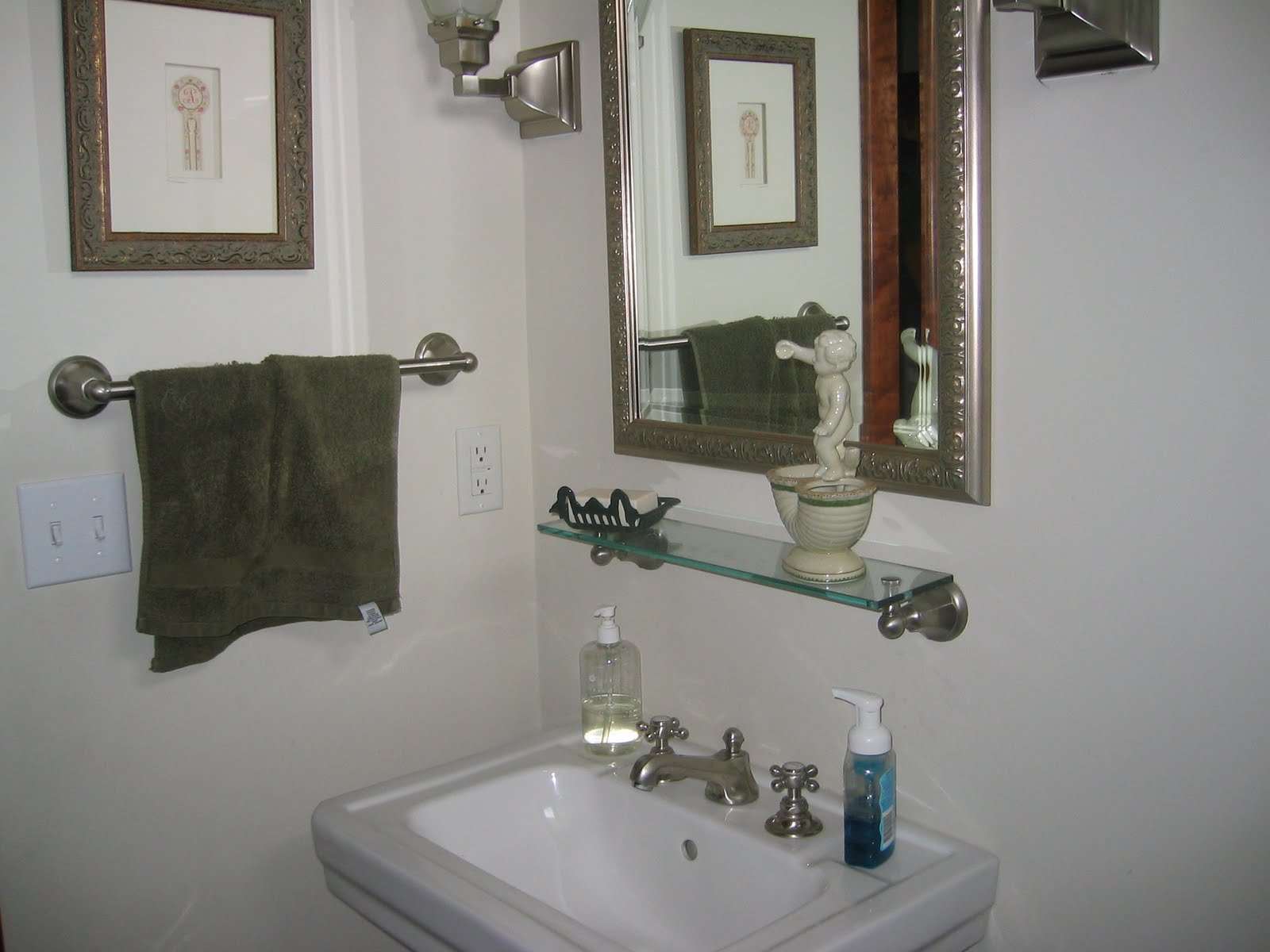
 Powder Room -- in the powder room, we wallpapered the walls with a Schumacher dusty rose/taupe, small leopard print which unfortunately is impossible to detect in this pic.

Powder Room -- my client changed out the wall shelf to a small wood/rattan chest.  Excellent choice I must say!

 
 Powder Room

 Master Bedroom sitting area -- we changed the built in bookcases from across to beside the chairs.  Added more Phillip Jeffries wallcovering, but in a rice paper texture/light carmel hue.  I also added Pollack fabric accent pillows to the chairs.

Seriously, Pollack and Phillip Jeffries are two of my favorite manufacturers to use!  Love their stuff!

Close up of Master Bedroom sitting area

 
Master Bedroom sitting area sofa -- we reupholstered the very floral sofa with a, yes you guessed it!, Pollack Body Wave fabric, brush trimmed the large pillows, and added a Pollack fabric accent pillow.

 Closeup of Master Bedroom sitting area chair pillow


 The majority of changes in this home had to do with the walls and a few accent pillows.  Yes, we did add some drapery, and reupholstered a sofa, etc.  But if just the walls and pillows were added, the changes would still have been enormous!  Hope this gives you inspiration for embracing the changes you want to make in your home!  Details are crucial, and the glue that holds it, and brings it all together!

I love to hear from you! ~~ Susan

MyFreeCopyright.com Registered & Protected