Showing posts with label Yellow. Show all posts

Wednesday, May 30, 2012

Pink, Orange and Yellow


I am just tickled pink, yes pun intended, about my Honeysuckle perennial this year!  The blossoms are just popping up everywhere.  The hummingbird moths are circling around, and boy are they cool, with horizontal and vertical striped bodies.  You can see one in the picture above towards the top.  I couldn't get a close-up picture that wasn't blurry, so I grabbed one off the web.


  Aren't they cool? It is called a White-lined spinx moth (Hyles lineata).  I thought for sure it had to be a hummingbird with its super fast wing speed and because they often make appearances around the plant as well, but then my daughter, all of very bright 13 years of age, pointed out..."no mom, birds do not have antennas".  Hmmm...little smarty pants...and of course, she's right.


I love the flowers.  So exotic with splays of petals in colorful pink, orange, gold, and yellow.  Almost sherbert like colors -- so I thought...hey! let's look at rooms using the same color combos!

Love the addition of the chartreuse!  Ellen Grasso Inc design, photo by Danny Piassick

OK, remember these soft blue curtains for future reference... Elle Decor

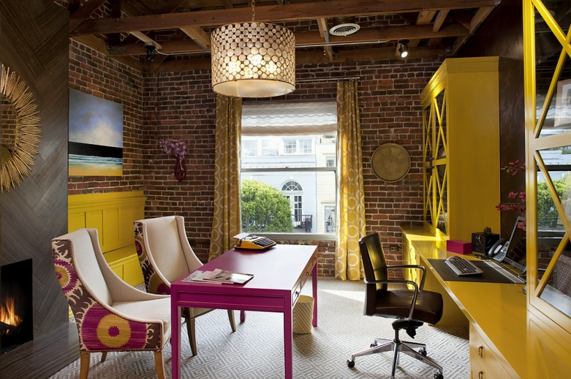
What I wouldn't give for an office like this?! The Donghia fabric on the back of the chairs is one of my favorites.  I used it in a foyer below. Artistic Designs for Living, Tineke Triggs


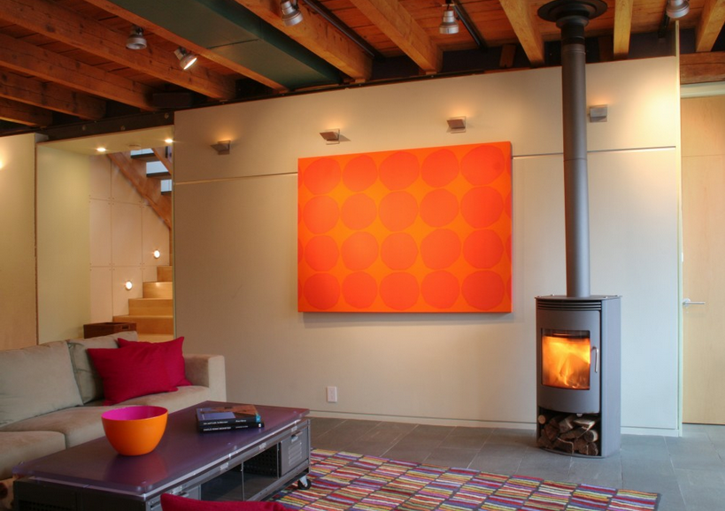
Stunning simplicity, with just enough color to warm it up, but not sacrifice the minimalist feel. Studio One-off Architecture and Design

Did you keep in mind the soft blue curtains from before?  Look again!  Soft blue brought in with pink and orange.  I like it!  pj hollyhocks design

Feeling the need to wear sherbert colors?  Look no further!  A summer shoe just for you!  JCPenney


Aahhh, my backyard again...  serene and relaxing...  Susan

MyFreeCopyright.com Registered & Protected

Wednesday, December 7, 2011

True Design!


I adore this pic!  Complementary colors of purple and yellow play off each other so well while shapes of clean, round minimalism in the purple Allium contrast with the textural fullness of the trees.  A true designers dream!

~~~ Susan ~~~
MyFreeCopyright.com Registered & Protected


Sunday, November 13, 2011

Guggenheim Paints based on Art, Showcasing Art!

Designers, architects, and other members of the trade, listen up!  You know how you or your client fall in love with a particular green in a Gauguin, or the vivid primaries of a Franz Marc, or the yellow of a Van Gogh?  Now you can have those colors in a home (ok, with those statements, I am feeling like an infomercial!).  Guggenheim in accordance with Fine Paints of Europe has come up with two paint fan decks.  One is based on the many colors from artworks in their permanent collection, and the other is based on colors used on walls in showcasing or creating gallery installations.  I love this idea, and am very excited to, hopefully someday, use these fan decks!

 Classical Fan Deck based on works from Guggenheim's Permanent Collection

 Circles on Franz Marc's Stables (Stallungen), 1913, showing where classical paint colors have been matched.  Oil on canvas, 29x62 inches (73.6 x 157.5 cm).  Solomon R. Guggenheim Museum, New York, Solomon R. Guggenheim Founding Collection 46.1037

Gallery fan deck with paint colors selected for the Guggenheim's building by Frank Lloyd Wright as well as wall colors preferred by curators for its installations to produce a certain ambiance.

Paint color, G013, from Guggenheim's interior ramps

 
 Paint color, G032, from the interior of Guggenheim's rotunda elevator

The two fan decks are not cheap ($50 and $100 each), and neither is Fine Paints of Europe exceedingly high quality paint.  They also have small 4 oz. sample pots for only $10 each -- yea!  However, if your goal is to truly match a particular hue in a famous art piece, or to truly use the best wall color to highlight your art collection, it is definitely worth the cost.

Have a hue-ti-ful day!!!  Susan


MyFreeCopyright.com Registered & Protected

Saturday, August 6, 2011

The Sticky Subject of Details

Hola!  Just picked my daughter up from Spanish camp, so I am feeling the whole Espanol vibe!  I am sharing with you a "before and after" project I did in 2004.  I think it is such an incredible example of why "the finishing details" in a room are so important.  We added mainly wall treatments and a few accessories in this project (a couple rooms went beyond that).  The results are amazing!  This home was an absolute stunner even before my changes!  It was a newer home truly built to look like an older home (most of you designers probably know why that is italicized :).  The homeowner had exceptional taste and had selected beautifully upholstered as well as gorgeous casegood pieces.  My initial reaction was "You need me how?".  But once I started looking beyond the beautiful architecture, gorgeous furniture and artwork, I realized the problem that had been bothering her for some time.  She needed the space to feel finished.  Here I come to the rescue!  Below are some of the before photos:

Before

 Sitting Area off Kitchen

Dining Room

 Living Room

Living Room

Living Room sofa

 Powder Room

Powder Room

Master Bedroom sitting area

 Master Bedroom sitting area sofa


After

Sitting Area off Kitchen -- we painted the walls yellow and added a red/gold valance

Dining Room--we painted this nook red and added corner curtains.  The majority of the drape is gold with a top red border, opposite proportions of the valance in the Kitchen.  Typically, I am not a fan of stationary drapes where the rod does not continue the length of the window.  However, in this application, a full rod above all three window walls would have created a very busy feeling particularly with the iron on the chandelier and the size of the space.  We needed something to soften the large expanse of windows which looks out onto wetlands and a pond.  No privacy was needed.

Dining Room going into Living Room--starting with the yellow paint color for the Living Room.  The gorgeous blue draperies were existing.

 Living Room -- in this room we continued the yellow paint around the room and added a Phillip Jeffries blue silk wallpaper on the ceiling in between the moulding.  I also added the blue silk wallpaper in the window seat areas.  At this picture taking time, we still needed to change out the two silver framed art prints on the right to something much more dramatic.

 Living Room window seat nook

 Close up of blue silk wallpaper on ceiling -- What a doozy that was for my installer!

 
Living Room -- on the sofa, I had 3 rectangular pillows made out of a fabulous Pollack Florabundance velvet embroidered and appliqued fabric.  The three identical pillows helps to ground the sofa space.  Our array of unique pillows was kept to the window seat area.

Close up of the sofa accent pillow

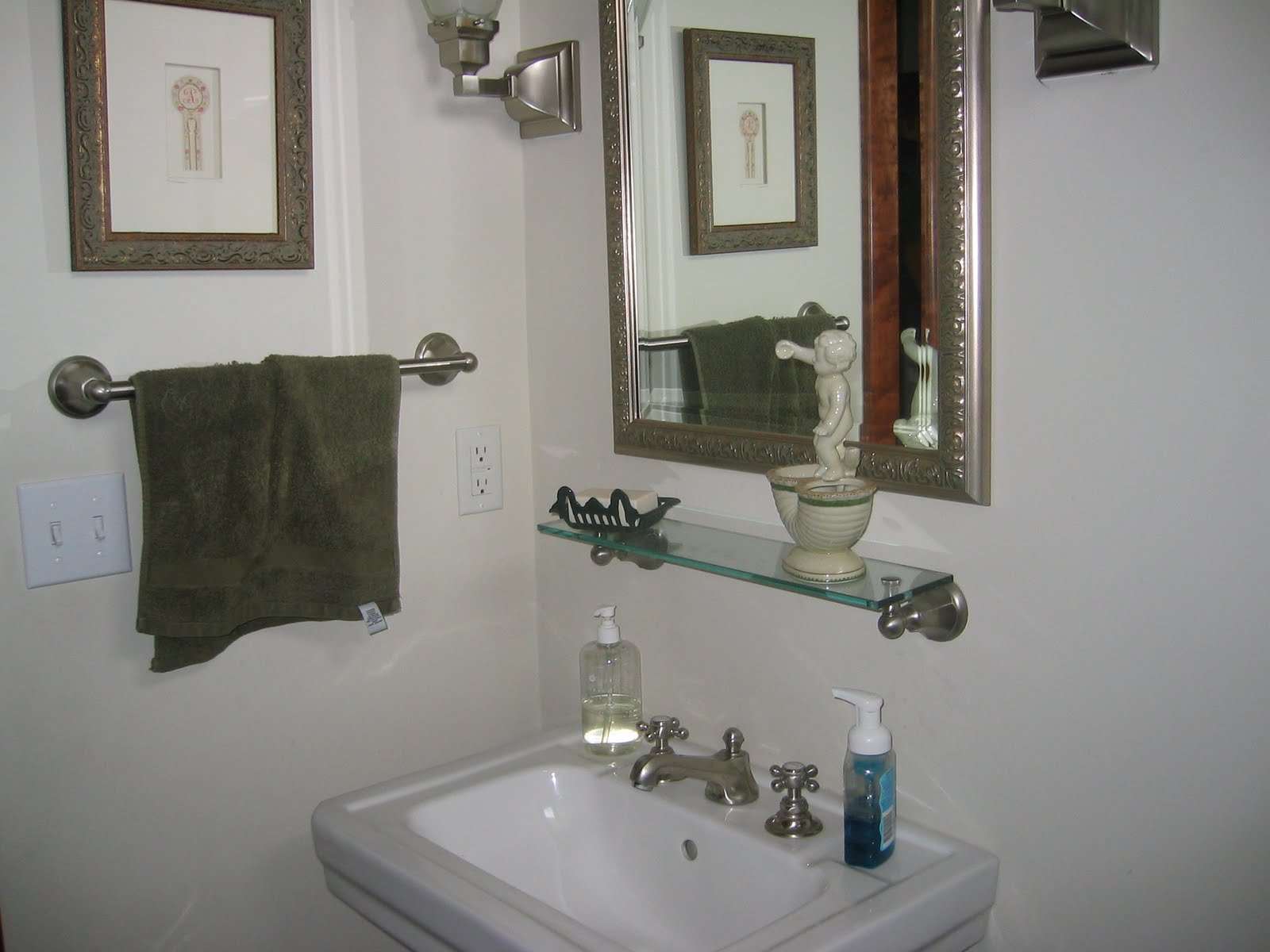
 Powder Room -- in the powder room, we wallpapered the walls with a Schumacher dusty rose/taupe, small leopard print which unfortunately is impossible to detect in this pic.

Powder Room -- my client changed out the wall shelf to a small wood/rattan chest.  Excellent choice I must say!

 
 Powder Room

 Master Bedroom sitting area -- we changed the built in bookcases from across to beside the chairs.  Added more Phillip Jeffries wallcovering, but in a rice paper texture/light carmel hue.  I also added Pollack fabric accent pillows to the chairs.

Seriously, Pollack and Phillip Jeffries are two of my favorite manufacturers to use!  Love their stuff!

Close up of Master Bedroom sitting area

 
Master Bedroom sitting area sofa -- we reupholstered the very floral sofa with a, yes you guessed it!, Pollack Body Wave fabric, brush trimmed the large pillows, and added a Pollack fabric accent pillow.

 Closeup of Master Bedroom sitting area chair pillow


 The majority of changes in this home had to do with the walls and a few accent pillows.  Yes, we did add some drapery, and reupholstered a sofa, etc.  But if just the walls and pillows were added, the changes would still have been enormous!  Hope this gives you inspiration for embracing the changes you want to make in your home!  Details are crucial, and the glue that holds it, and brings it all together!

I love to hear from you! ~~ Susan

MyFreeCopyright.com Registered & Protected

Saturday, July 2, 2011

4th of JULY!!!!!!!!!!

HAPPY 4th OF JULY EVERYONE!!!


Here's a funky room pic I took from the High Point Furniture Market this last Spring.  It was in a sustainable art exhibit.  If you remember, I had a close up pic of the chandelier, which is made from paper coffee cups, in a previous post here.  Think of the below room as a take on the traditional red, white, and blue with a splash of sunshine yellow!


Have a "bang up"(safely) time this 4th!!!

✯✯✯✯✯ Susan ✯✯✯✯✯
MyFreeCopyright.com Registered & Protected