Showing posts with label gold. Show all posts

Sunday, April 13, 2014

Artisan Pieces -- cocktail table

One of my favorite resources is using local artists for bespoke (custom) products in my room environments! They add a strong personal, unique touch like nothing else! Usually the need arises from not finding the particular piece I had in mind for the space, whether that be the exact style, color, size, timeline, or price. Lately, I have been able to do quite a bit and it's a real treat!!

Below is a piece I designed for a recent music room/library. I collaborated with Asa Hoyt of A.W. Hoyt Metal Arts discussing the particulars of my design combined with his expert opinion in metal working so we could create a stable and interesting piece. I knew I wanted the piece to have an aged gold, retro, yet clean feel. Since the client has grandkids who roam the house at will, I wanted to make sure the top was resistant to scratches, stains, etc. but still giving us that clean Carrara marble look. Hello Cambria! And Voila'! Asa's fabulous metal table base with a Cambria Torquay top!


On to the golding: I had the table delivered to Candice Simpson of Textural Hues. Candice has worked on oodles of my projects, whether it is a decorative paint finish on a wall, accessory, or piece of furniture. We selected the color of gold (there are many!) for the legs, one part being base and the other a metallic paint finish, percentage of metallic to base and location of distressing. When all was completed, it was delivered!!


I think it's perfect!!

Art~~It's a good thing!! Later, Susan

MyFreeCopyright.com Registered & Protected

Wednesday, August 22, 2012

Football Colors on HOUZZ


Fall is here...almost!  This has been an incredibly busy, busy summer for me, and for many people I know.  There must be some weird karma energy in the air uniting the emotional and hectic vibes.  Unfortunately, it has not been all positive.  Some events this summer have been exciting, some tragic, some nervewracking, and some just plain "yeah, ok, whatever".  Maybe that's why it's felt so busy...the emotions have been nothing short of a whirlwind!  Nonetheless, a lack of writing has certainly prevailed!  Hear, hear!!  With that statement, I feel like I should be in a medieval village courtyard listening to the angry crowd yell!  OK, back to design...  Getting excited for the football season?!  Well check out this article by Houzz.com writer Lisa Frederick where they featured one of my designs to represent the West Virginia Mountaineers colors of blue and gold!!

Show Your Team Spirit With Colors

Announce your football allegiance with something subtler than a shout: rooms dressed in color palettes to match your team!

In Alabama, where I live, sports — especially college football — are king. Almost every conversation eventually turns to how (insert team here) looks at spring practice, or how they'll fare in the upcoming season, or how they blew it in the big game last weekend. So it goes without saying that folks here aren't shy about putting their fandom on display at home, inside and out.   ~~click here to continue reading and see images~~


Hut, hut, hut...(that is what the quarterback says, right?)  ~Susan~

MyFreeCopyright.com Registered & Protected

Wednesday, May 30, 2012

Pink, Orange and Yellow


I am just tickled pink, yes pun intended, about my Honeysuckle perennial this year!  The blossoms are just popping up everywhere.  The hummingbird moths are circling around, and boy are they cool, with horizontal and vertical striped bodies.  You can see one in the picture above towards the top.  I couldn't get a close-up picture that wasn't blurry, so I grabbed one off the web.


  Aren't they cool? It is called a White-lined spinx moth (Hyles lineata).  I thought for sure it had to be a hummingbird with its super fast wing speed and because they often make appearances around the plant as well, but then my daughter, all of very bright 13 years of age, pointed out..."no mom, birds do not have antennas".  Hmmm...little smarty pants...and of course, she's right.


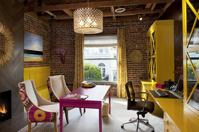
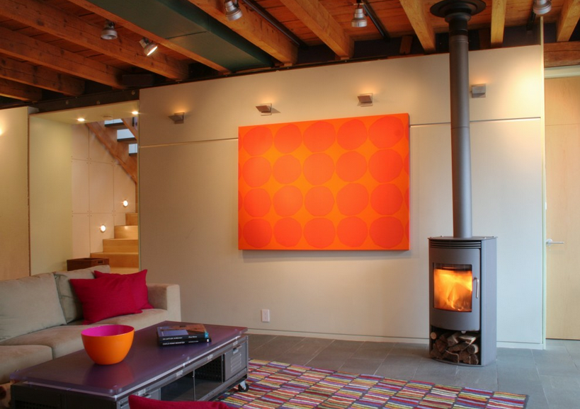
I love the flowers.  So exotic with splays of petals in colorful pink, orange, gold, and yellow.  Almost sherbert like colors -- so I thought...hey! let's look at rooms using the same color combos!

Love the addition of the chartreuse!  Ellen Grasso Inc design, photo by Danny Piassick

OK, remember these soft blue curtains for future reference... Elle Decor

What I wouldn't give for an office like this?! The Donghia fabric on the back of the chairs is one of my favorites.  I used it in a foyer below. Artistic Designs for Living, Tineke Triggs


Stunning simplicity, with just enough color to warm it up, but not sacrifice the minimalist feel. Studio One-off Architecture and Design

Did you keep in mind the soft blue curtains from before?  Look again!  Soft blue brought in with pink and orange.  I like it!  pj hollyhocks design

Feeling the need to wear sherbert colors?  Look no further!  A summer shoe just for you!  JCPenney


Aahhh, my backyard again...  serene and relaxing...  Susan

MyFreeCopyright.com Registered & Protected

Saturday, May 5, 2012

Small Gold Treasure


Hi all!  I know this week I was going to continue with the Dining Room of a main floor project I am working on, but alas, I did not have time to get photos of the selections we are using, so will have to postpone that one until next week.

In the meantime, I have a wonderful little find I picked up in an antique store I want to share.  It was a long time in the making, that's for sure.  I picked up this adorable little gold table last summer.  One can never have too many little tables!  However, when expressing this sentiment as my son was in the same room, his reply was, "Mom, more little tables are not always the answer." Mon Cher!

When I took all the crap off of the top of the table while in the antique store, the glass top was severely cracked and broken, so the guy took $5 off.  Then I tipped it upside down, and one of the four gold floral stalks came loose...there went another $5.  Then I noticed one of the corners wasn't secure...yep, you guessed it, another $5!  I was really enjoying this game!!  It started at $55 (still a steal I thought) and ended at $40.

I had my friend Kelly Ludeking, a fabulous metal artist who has a done a lot of work for me over the years, weld the corner that had come loose.  Not a good pic, I know.  That was $50.


 I believe my son, or husband, super glued or siliconed the extra floral branch in place.  Free! (to me :)

Next, I had glass made for the top.  I knew I wanted extra thick chunky glass so I would have a blue ring at the top when the sunlight hit it.  Because the metal corners were slightly curved, the glass piece had to have radiuses cut into them, definitely an increase in price.  By the time we were done, the glass piece cost $100.

 View from the top

 And another...

Lookin' good!!

About $200 later, I love my table!!  It works well in my very eclectic, yet inviting, living room!  Do you have fabulous finds and trinkets to share?  Let me know!

Keep digging for treasure!!  Susan


MyFreeCopyright.com Registered & Protected

Thursday, April 26, 2012

Gold and Fuchsia Cocktails


How amazing is this banquette??!!  This is a cocktail lounge in the state of the art Clarion Hotel Post in Gothenburg, Sweden. The shiny gold, the uber long length, the tufting...what a stunning way to create a glamourous, cocktail area in a long space.  I love the color combo of golden chartreuse with fuchsia (ok have to admit one of my favorite color combos that I use frequently), and the black tables work nicely to ground the highly colored area.  Look at those chaotic, but in a good way, shelves in back. They add necessary flow, movement, and interruption to an otherwise highly organized seating area.  Truly love almost all of the environment and its elements. I have to say the one thing I am questioning is the carpet...looks like a crummy remnant piece in this pic, but I am guessing, hopefully, that's just this 2D pic but in 3D reality, works beautifully!!

Stay chic!!  Susan

MyFreeCopyright.com Registered & Protected

Tuesday, January 31, 2012

MH Living Room Progress

Hello!  I'm excited to share with you progress on a living room I'm working on.  It is in the same home as the kitchen we were working on back here.  We recently installed quite a bit of the new furnishings, pretty much everything you see in the below pics.  We still have a couple more custom pieces as well as accessories in the works.  Enjoy, and stay tuned for more!

Coming together nicely, if I must say so myself!

 The gold etagere is so scrumptious -- I'll have to take some close ups of the wonderfully, layered on gold finish!

 What?!  But Milo, how could something outside be more interesting than all of the gorgeous furnishings???

 I love the style of this chair!!

Aaahhh...bliss...


~~~Susan~~~


MyFreeCopyright.com Registered & Protected

Saturday, December 31, 2011

Bloody Lovely!


This is a very catching vignette!  Why am I calling it "Bloody Lovely"?  It feels English to me, but not Grandma's English, but instead a more youthful English.  I love the symmetry.  I love the dissonance between the coral, pink, and red colors.  I love the way the warm gold, whispy wall candelabras contrast with the cool boldness of the painting.  I love the juxtaposition of traditional, contemporary, retro, and Asian styling.  I love how the color black is strategically positioned to carry your eye around, and ground, the room starting with the woman's hair, to the lampshades, to the arced feet of the sofa.  So completely pleasing to my eye!!

~~ Susan ~~
MyFreeCopyright.com Registered & Protected

Saturday, August 6, 2011

The Sticky Subject of Details

Hola!  Just picked my daughter up from Spanish camp, so I am feeling the whole Espanol vibe!  I am sharing with you a "before and after" project I did in 2004.  I think it is such an incredible example of why "the finishing details" in a room are so important.  We added mainly wall treatments and a few accessories in this project (a couple rooms went beyond that).  The results are amazing!  This home was an absolute stunner even before my changes!  It was a newer home truly built to look like an older home (most of you designers probably know why that is italicized :).  The homeowner had exceptional taste and had selected beautifully upholstered as well as gorgeous casegood pieces.  My initial reaction was "You need me how?".  But once I started looking beyond the beautiful architecture, gorgeous furniture and artwork, I realized the problem that had been bothering her for some time.  She needed the space to feel finished.  Here I come to the rescue!  Below are some of the before photos:

Before

 Sitting Area off Kitchen

Dining Room

 Living Room

Living Room

Living Room sofa

 Powder Room

Powder Room

Master Bedroom sitting area

 Master Bedroom sitting area sofa


After

Sitting Area off Kitchen -- we painted the walls yellow and added a red/gold valance

Dining Room--we painted this nook red and added corner curtains.  The majority of the drape is gold with a top red border, opposite proportions of the valance in the Kitchen.  Typically, I am not a fan of stationary drapes where the rod does not continue the length of the window.  However, in this application, a full rod above all three window walls would have created a very busy feeling particularly with the iron on the chandelier and the size of the space.  We needed something to soften the large expanse of windows which looks out onto wetlands and a pond.  No privacy was needed.

Dining Room going into Living Room--starting with the yellow paint color for the Living Room.  The gorgeous blue draperies were existing.

 Living Room -- in this room we continued the yellow paint around the room and added a Phillip Jeffries blue silk wallpaper on the ceiling in between the moulding.  I also added the blue silk wallpaper in the window seat areas.  At this picture taking time, we still needed to change out the two silver framed art prints on the right to something much more dramatic.

 Living Room window seat nook

 Close up of blue silk wallpaper on ceiling -- What a doozy that was for my installer!

 
Living Room -- on the sofa, I had 3 rectangular pillows made out of a fabulous Pollack Florabundance velvet embroidered and appliqued fabric.  The three identical pillows helps to ground the sofa space.  Our array of unique pillows was kept to the window seat area.

Close up of the sofa accent pillow

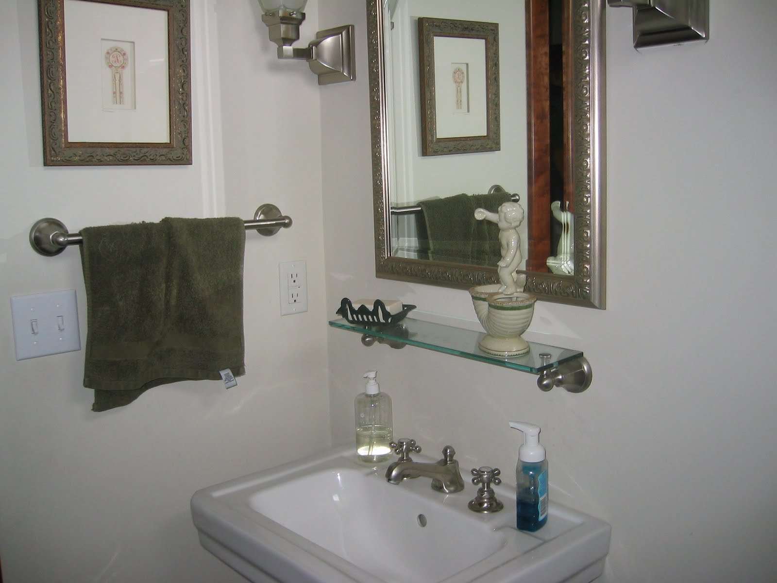
 Powder Room -- in the powder room, we wallpapered the walls with a Schumacher dusty rose/taupe, small leopard print which unfortunately is impossible to detect in this pic.

Powder Room -- my client changed out the wall shelf to a small wood/rattan chest.  Excellent choice I must say!

 
 Powder Room

 Master Bedroom sitting area -- we changed the built in bookcases from across to beside the chairs.  Added more Phillip Jeffries wallcovering, but in a rice paper texture/light carmel hue.  I also added Pollack fabric accent pillows to the chairs.

Seriously, Pollack and Phillip Jeffries are two of my favorite manufacturers to use!  Love their stuff!

Close up of Master Bedroom sitting area

 
Master Bedroom sitting area sofa -- we reupholstered the very floral sofa with a, yes you guessed it!, Pollack Body Wave fabric, brush trimmed the large pillows, and added a Pollack fabric accent pillow.

 Closeup of Master Bedroom sitting area chair pillow


 The majority of changes in this home had to do with the walls and a few accent pillows.  Yes, we did add some drapery, and reupholstered a sofa, etc.  But if just the walls and pillows were added, the changes would still have been enormous!  Hope this gives you inspiration for embracing the changes you want to make in your home!  Details are crucial, and the glue that holds it, and brings it all together!

I love to hear from you! ~~ Susan

MyFreeCopyright.com Registered & Protected