Hola! Just picked my daughter up from Spanish camp, so I am feeling the whole Espanol vibe! I am sharing with you a "before and after" project I did in 2004. I think it is such an incredible example of why "the finishing details" in a room are so important. We added mainly wall treatments and a few accessories in this project (a couple rooms went beyond that). The results are amazing! This home was an absolute stunner even before my changes! It was a newer home truly built to look like an older home (most of you designers probably know why that is italicized :). The homeowner had exceptional taste and had selected beautifully upholstered as well as gorgeous casegood pieces. My initial reaction was "You need me how?". But once I started looking beyond the beautiful architecture, gorgeous furniture and artwork, I realized the problem that had been bothering her for some time. She needed the space to feel finished. Here I come to the rescue! Below are some of the before photos:
Before
Sitting Area off Kitchen
Dining Room
Living Room
Living Room
Living Room sofa
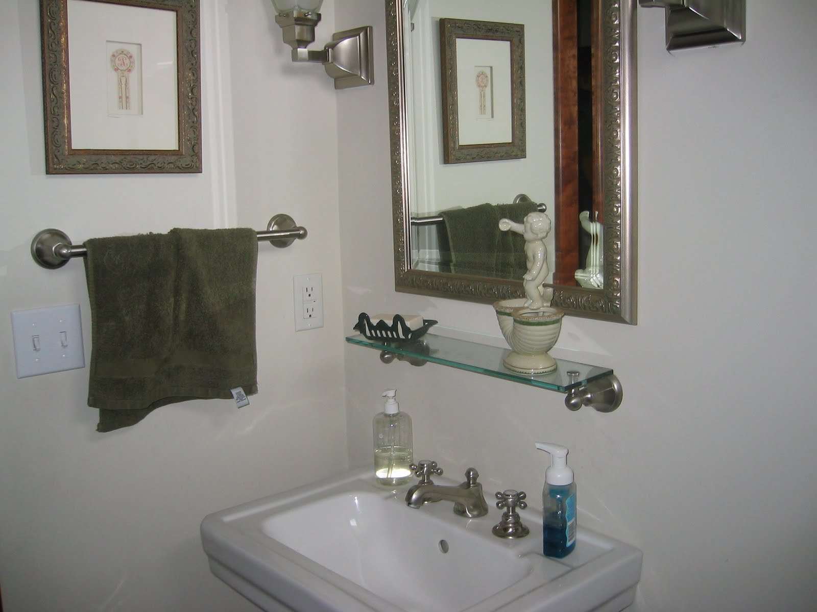
Powder Room
Powder Room
Master Bedroom sitting area
Master Bedroom sitting area sofa
After
Sitting Area off Kitchen -- we painted the walls yellow and added a red/gold valance
Dining Room--we painted this nook red and added corner curtains. The majority of the drape is gold with a top red border, opposite proportions of the valance in the Kitchen. Typically, I am not a fan of stationary drapes where the rod does not continue the length of the window. However, in this application, a full rod above all three window walls would have created a very busy feeling particularly with the iron on the chandelier and the size of the space. We needed something to soften the large expanse of windows which looks out onto wetlands and a pond. No privacy was needed.
Dining Room going into Living Room--starting with the yellow paint color for the Living Room. The gorgeous blue draperies were existing.
Living Room -- in this room we continued the yellow paint around the room and added a
Phillip Jeffries blue silk wallpaper on the ceiling in between the moulding. I also added the blue silk wallpaper in the window seat areas. At this picture taking time, we still needed to change out the two silver framed art prints on the right to something much more dramatic.
Living Room window seat nook
Close up of blue silk wallpaper on ceiling -- What a doozy that was for my installer!
Living Room -- on the sofa, I had 3 rectangular pillows made out of a fabulous
Pollack Florabundance velvet embroidered and appliqued fabric. The three identical pillows helps to ground the sofa space. Our array of unique pillows was kept to the window seat area.
Close up of the sofa accent pillow
Powder Room -- in the powder room, we wallpapered the walls with a
Schumacher dusty rose/taupe, small leopard print which unfortunately is impossible to detect in this pic.
Powder Room -- my client changed out the wall shelf to a small wood/rattan chest. Excellent choice I must say!
Powder Room
Master Bedroom sitting area -- we changed the built in bookcases from across to beside the chairs. Added more
Phillip Jeffries wallcovering, but in a rice paper texture/light carmel hue. I also added
Pollack fabric accent pillows to the chairs.
Seriously, Pollack and Phillip Jeffries are two of my favorite manufacturers to use! Love their stuff!
Close up of Master Bedroom sitting area
Master Bedroom sitting area sofa -- we reupholstered the very floral sofa with a, yes you guessed it!,
Pollack Body Wave fabric, brush trimmed the large pillows, and added a Pollack fabric accent pillow.
Closeup of Master Bedroom sitting area chair pillow
The majority of changes in this home had to do with the walls and a few accent pillows. Yes, we did add some drapery, and reupholstered a sofa, etc. But if just the walls and pillows were added, the changes would still have been enormous! Hope this gives you inspiration for embracing the changes you want to make in your home! Details are crucial, and the glue that holds it, and brings it all together!
I love to hear from you! ~~ Susan